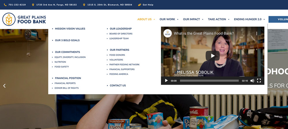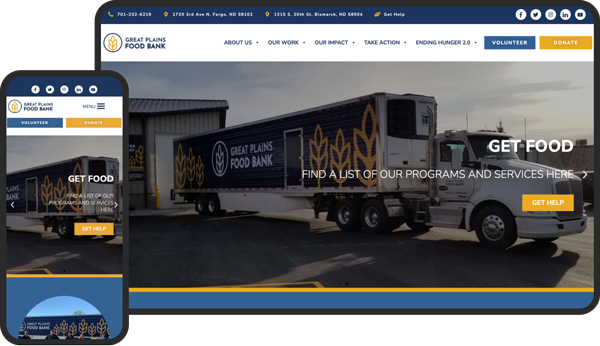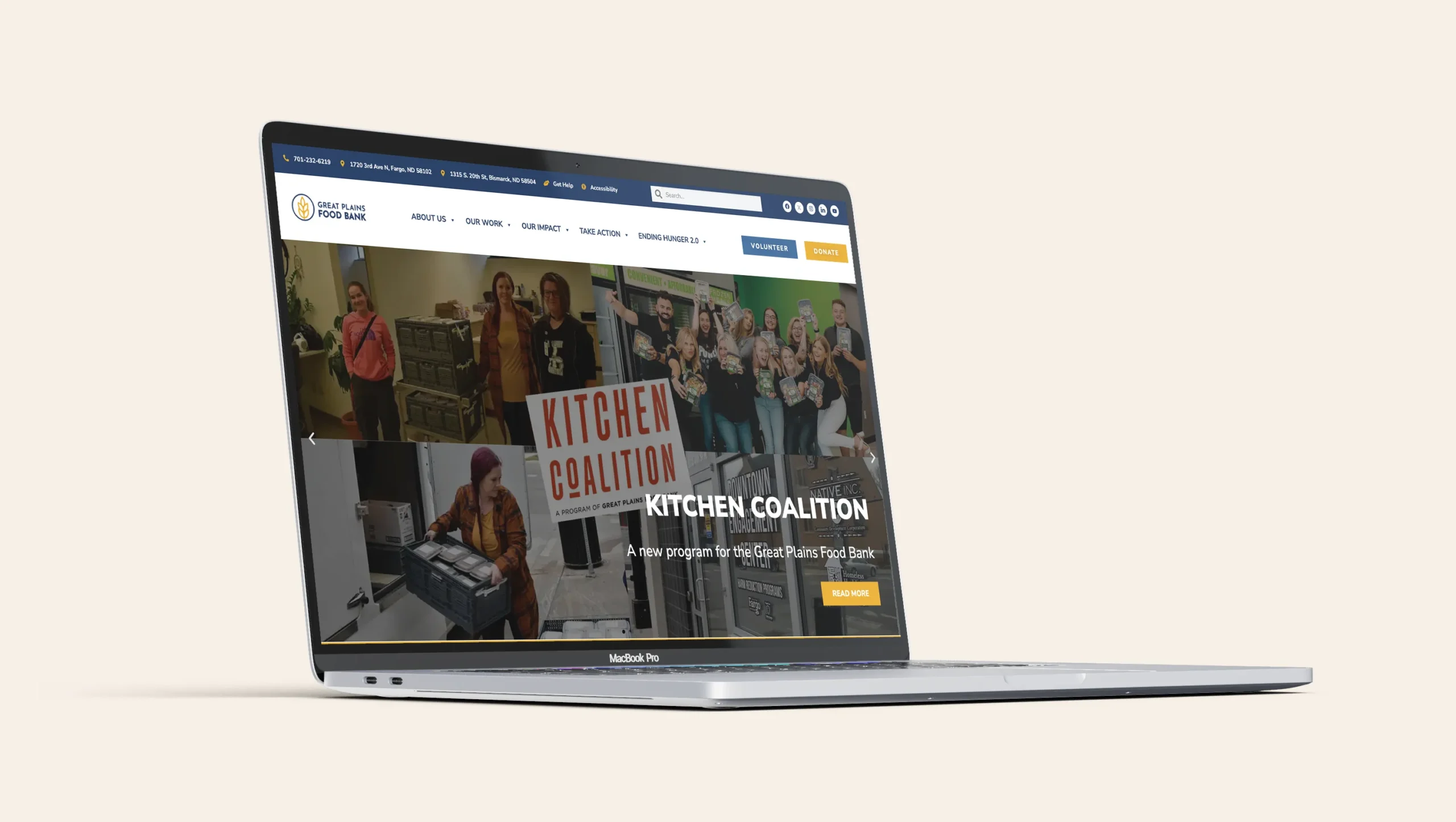
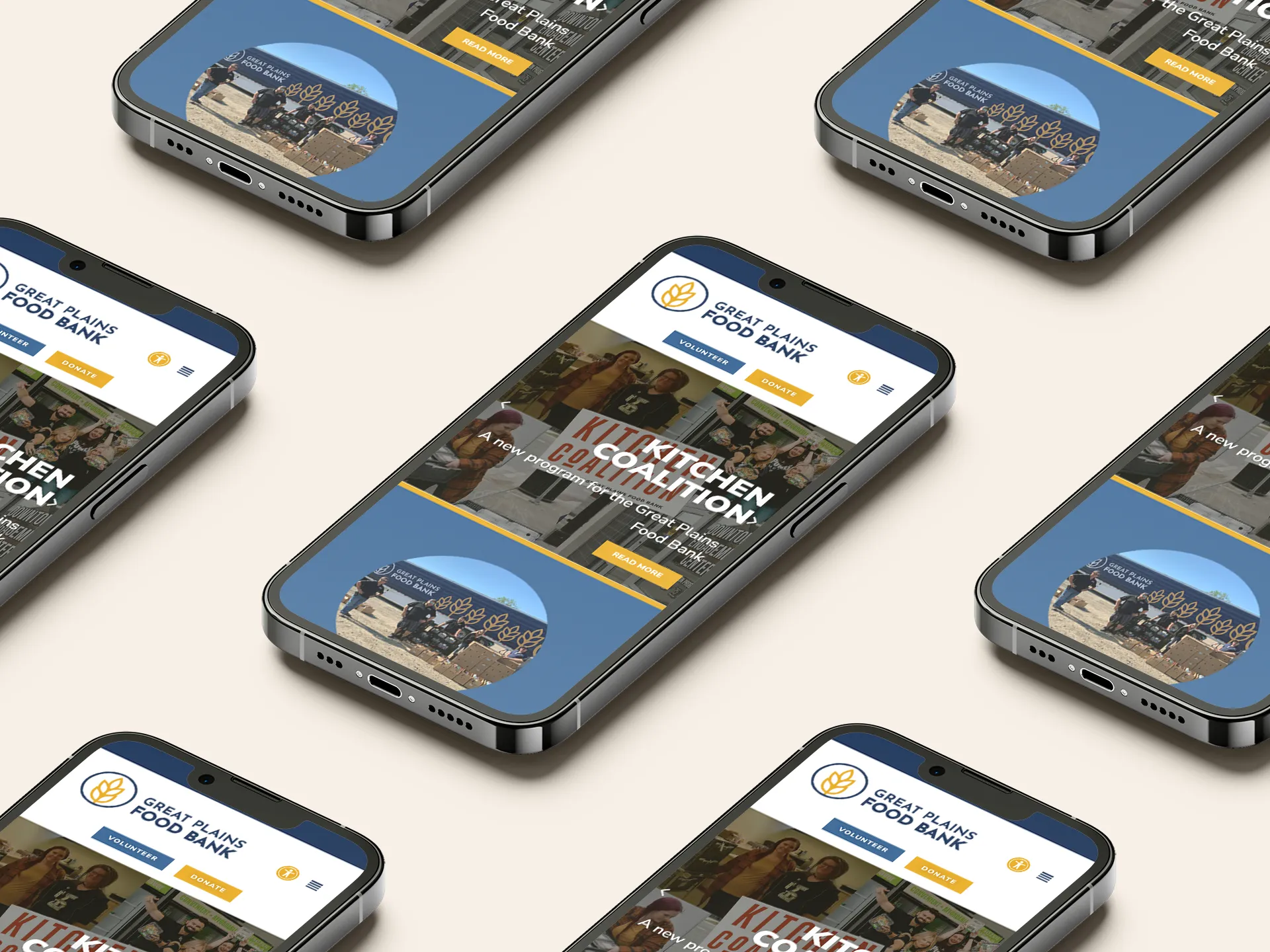
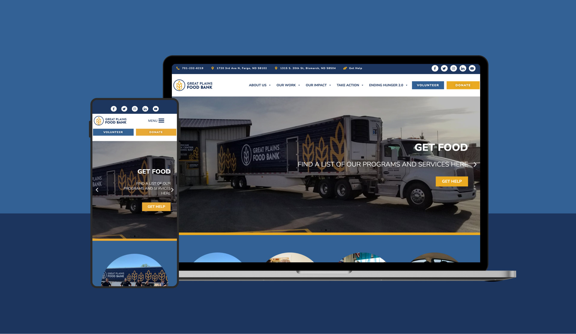
We uplifted the UI of the website with a clean and colourful design that allows the user to easily identify the different sections of the website. It highlights the 3 conversion goals on the landing page and throughout the website. The UX was highly improved by the super navigation, with a much better practical organisation. I used WordPress, Elementor, and ACF to create a platform that is easy to update without the use of code. I also used the WordPress user functionality to solve the private employee portal challenge.
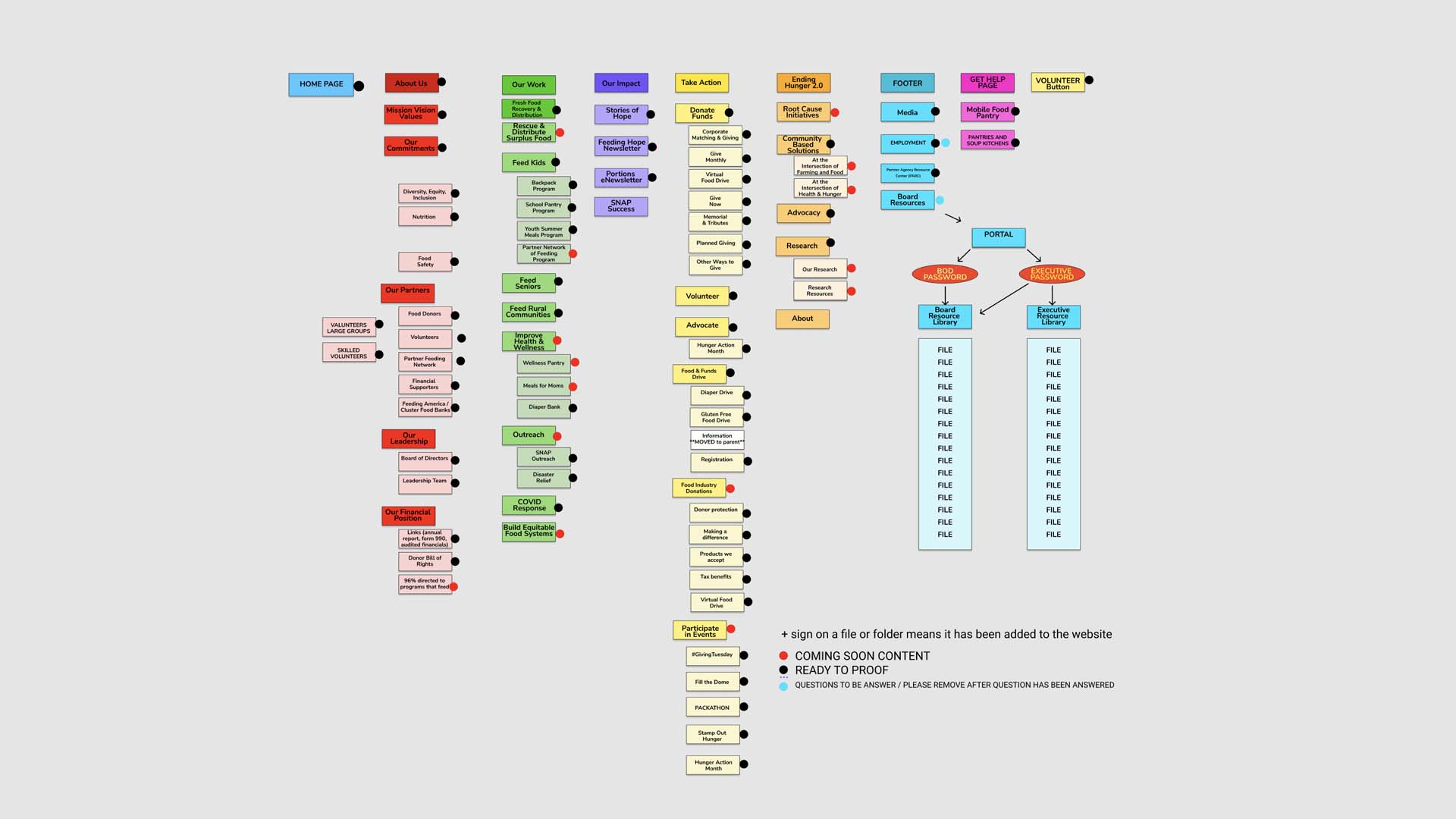
We created the sitemap together with the client with the intention to highlight and pinpoint the hierarchical value of the content. The sitemap included a list of pages and sections existing on the website.
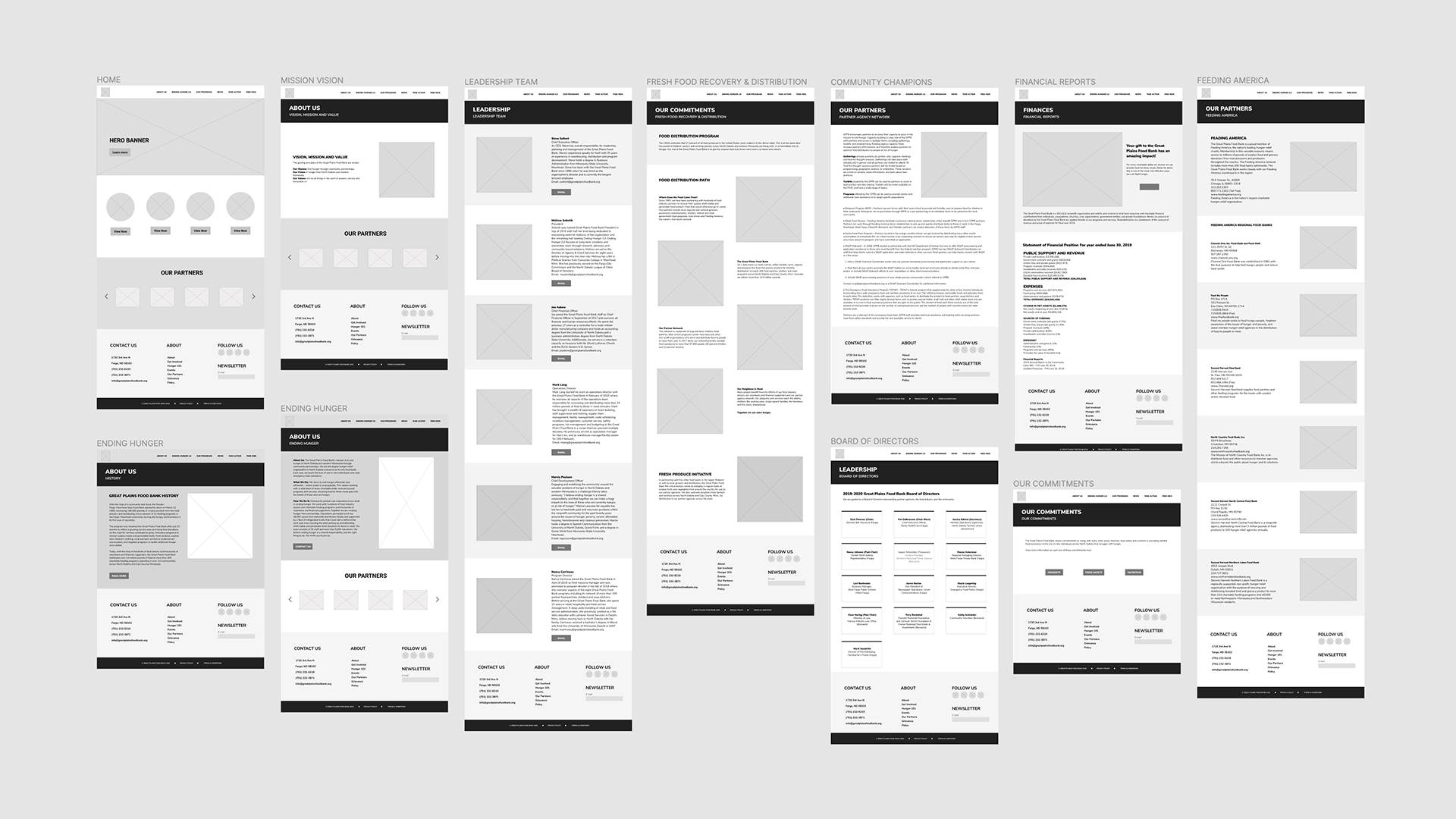
Wireframes were used as the foundation of the design. We used basic black and white depictions of what the product will look like. These were used to demonstrate the basic design of the product to the client.
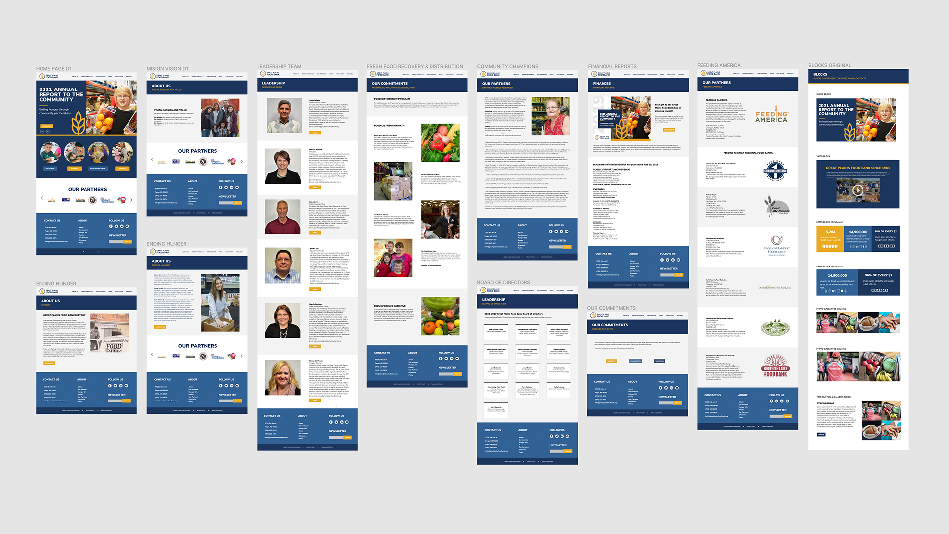
Prototypes were created for usability testing and user feedback. These were used during consultation with the client to generate insights for the final product.
The super navigation was a key component to organising the vast amount of pages and content on the site. I decided to use this approach as it provided a more straightforward way for the user to navigate between different sections of the website using a simple mouse hover. This setup displays a list of sections grouped by related content together with videos and images upon hovering over the navigation bar.
