Sandy's Donuts

THE CHALLENGE

Sandy’s donuts is a Fargo, North Dakota native company selling delicious, handcrafted donuts. They came to us with a request to create an e-commerce store with custom-built functionality. The resulting design had to tackle two challenges- a technical aspect involving user customisation of their order and a creative aspect focusing on driving sales through engaging visual design and irresistible photography.

THE SOLUTION

The primary focus for the visual design was to create imagery that taps into people’s cravings. To do that, we combined a beautiful product photography with fun and colourful design reflective of their statement donuts and flavours. 

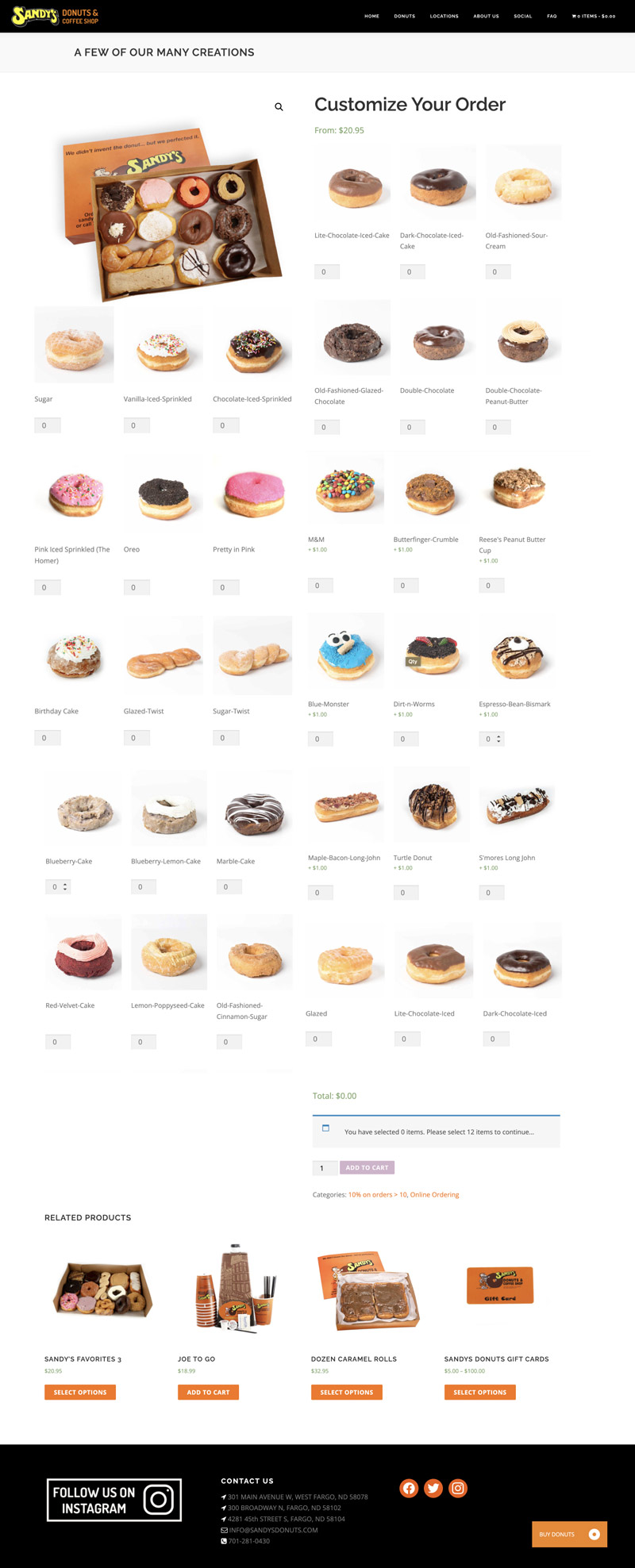
The main goal of the technical aspect of this task was to create a website that features a custom functionality allowing customers to build their dream box of donuts, catering to their unique cravings. To achieve this goal we crafter the user experience and interface (UX/UI) in the following steps:
  • Understanding User Needs: Through user research and competitor analysis, we identified key pain points of existing donut e-commerce experiences. Customers seem to value variety and flexibility in choosing their donuts.
  • Building a User Journey:  User flow charts mapped out the customer’s journey, from browsing donut flavours to customising their box and completing the checkout process. This ensured a smooth and intuitive experience at every touchpoint.
  • Designing for Delight:  A visually appealing interface was created using high-quality donut photos and a clean layout that showcased the delicious product. Intuitive menus and clear calls to action guided users through the customization process, making it easy for them to build their perfect donut box.
  • WordPress Customization:  Leveraging the power of WordPress, a custom plugin was developed to facilitate the donut box building functionality. This plugin allowed customers to select individual donuts based on category, ensuring a seamless and enjoyable buying experience.
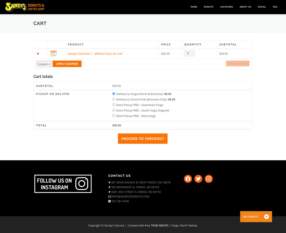
  • User-friendly interface: The website allows customers to select their preferred pickup location from the 3 Sandy’s Donuts stores. The website streamlines the ordering process with clear confirmation emails, including estimated pickup times at the chosen location.
  • Responsive Design: The website was meticulously designed to be responsive across all devices – desktop, tablet, and mobile. This ensured a user-friendly experience for customers regardless of how they accessed the website.

SERVICES

  • UI/UX
  • Web Development
  • Graphic Design
  • Photography

CREDITS

  • Team Abovo

pickup & delivery.

custom product.

photography.

Web Design