The goal of the Kokada project was to create a vibrant and playful visual identity for a new, healthy alternative to nut-based spreads. In my designs, I aimed to bridge the gap between healthy products and youthful energy, demonstrating that healthy living can be fun and exciting.
The first step in my design process was to understand the brand through collaboration with the client. This gave me a clear understanding of their brand values and their target audience. This phase involved brainstorming sessions and competitor research to solidify the brand’s unique voice and future market position.
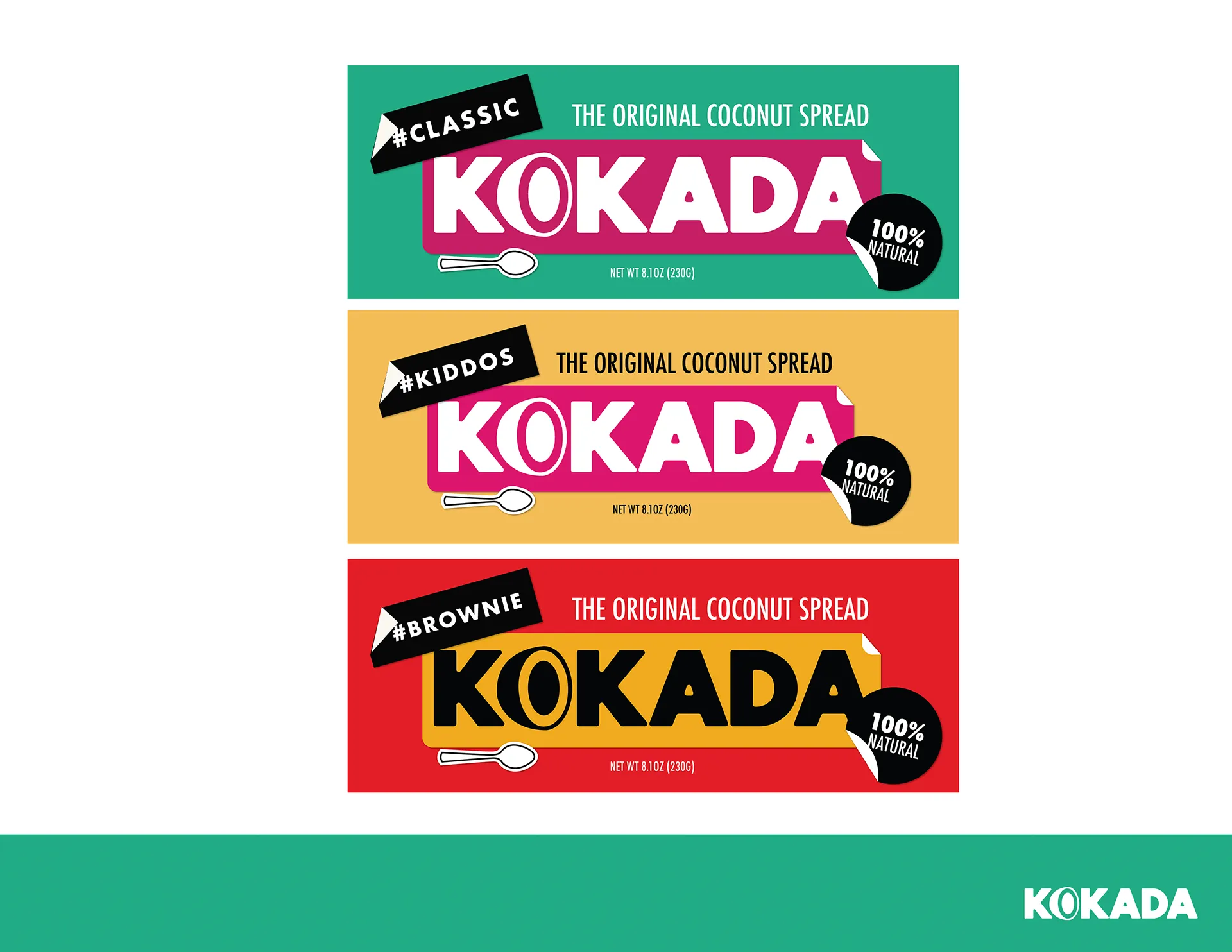
During concept development, we used sketches and mood boards to explore various design directions that captured the brand’s essence of youthful fun and healthy living. In this stage, we created various designs and “feels” for the client and the target demographic. The chosen concept was then translated into a comprehensive visual identity system. This included developing a logo design, colour palette, typography, and graphic elements that would be consistently applied across all branding touchpoints.
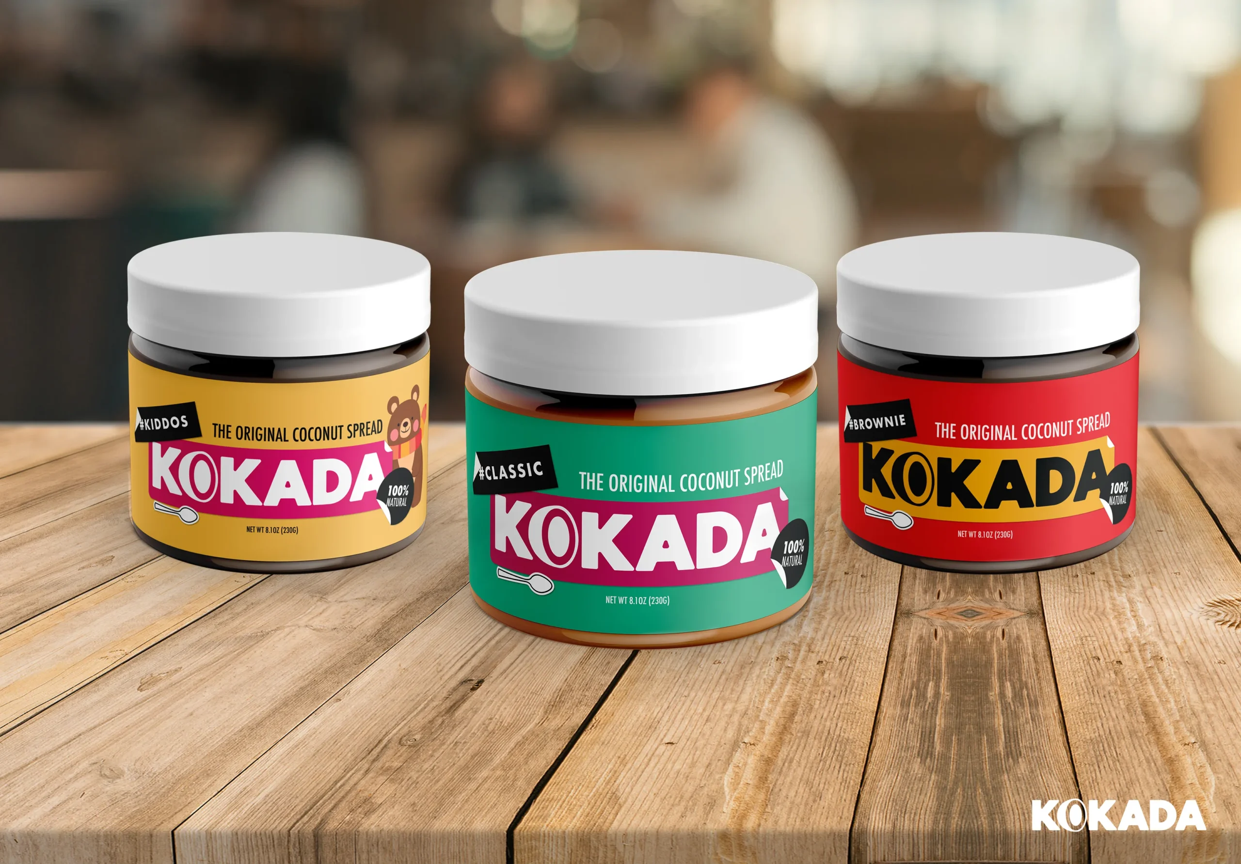
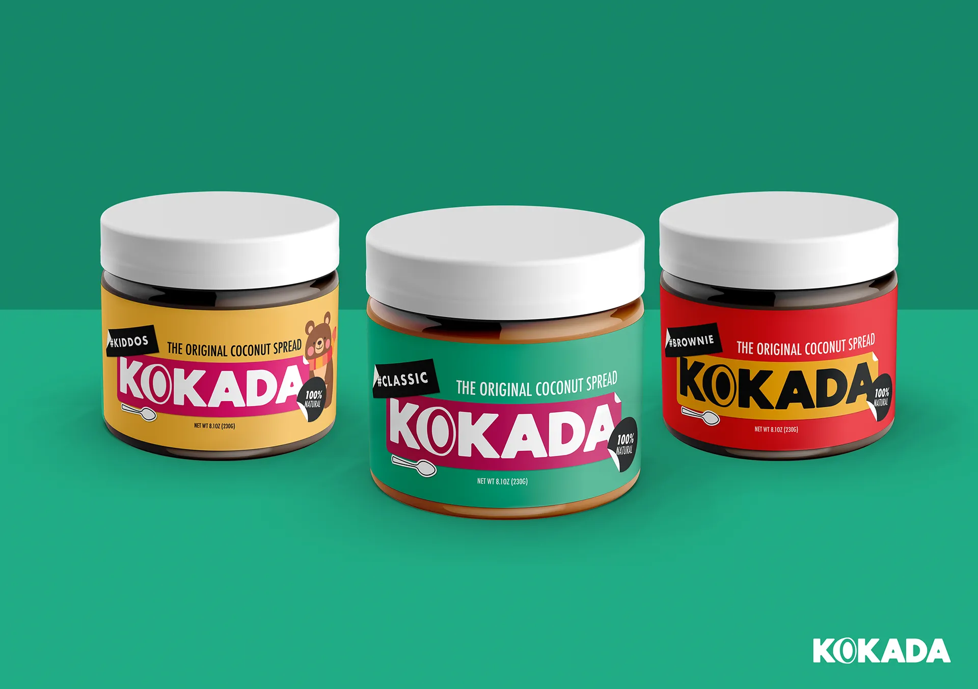
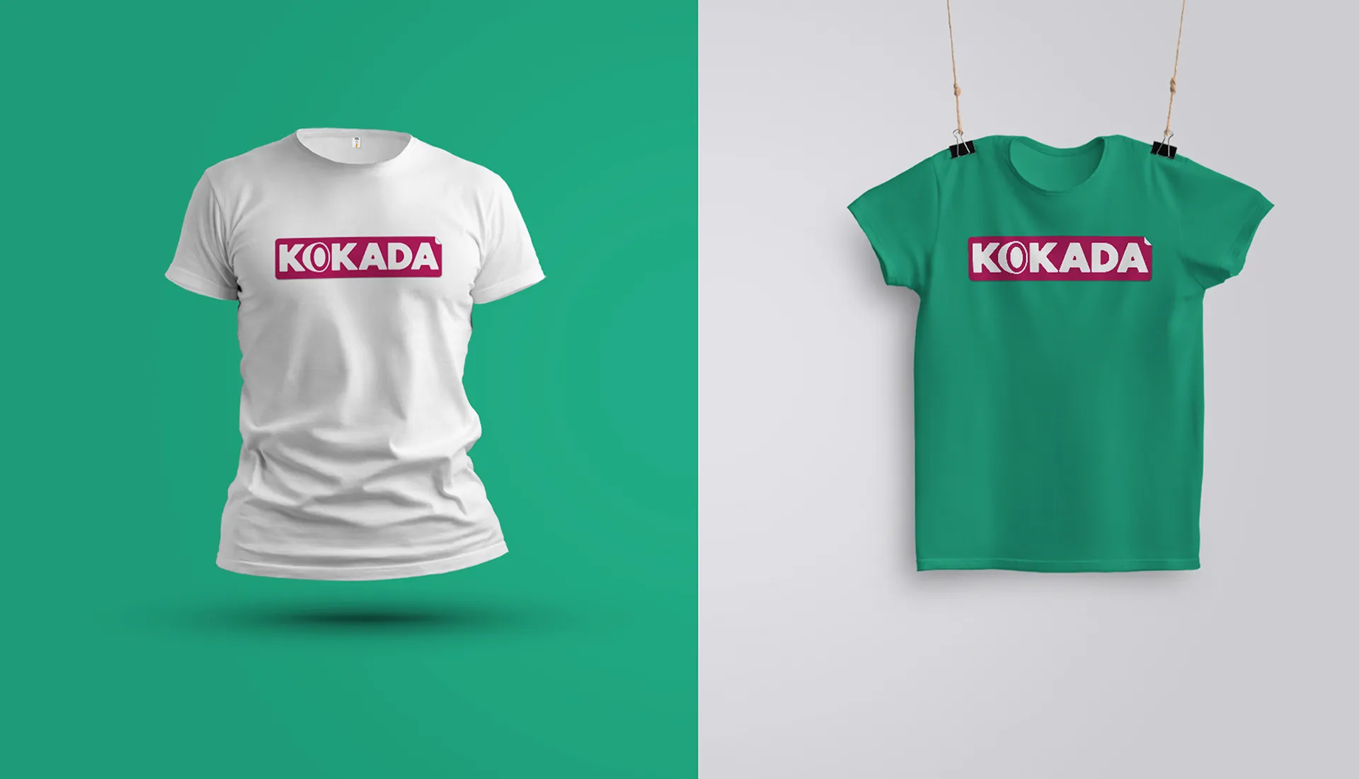
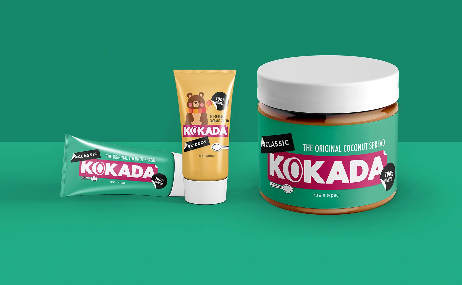
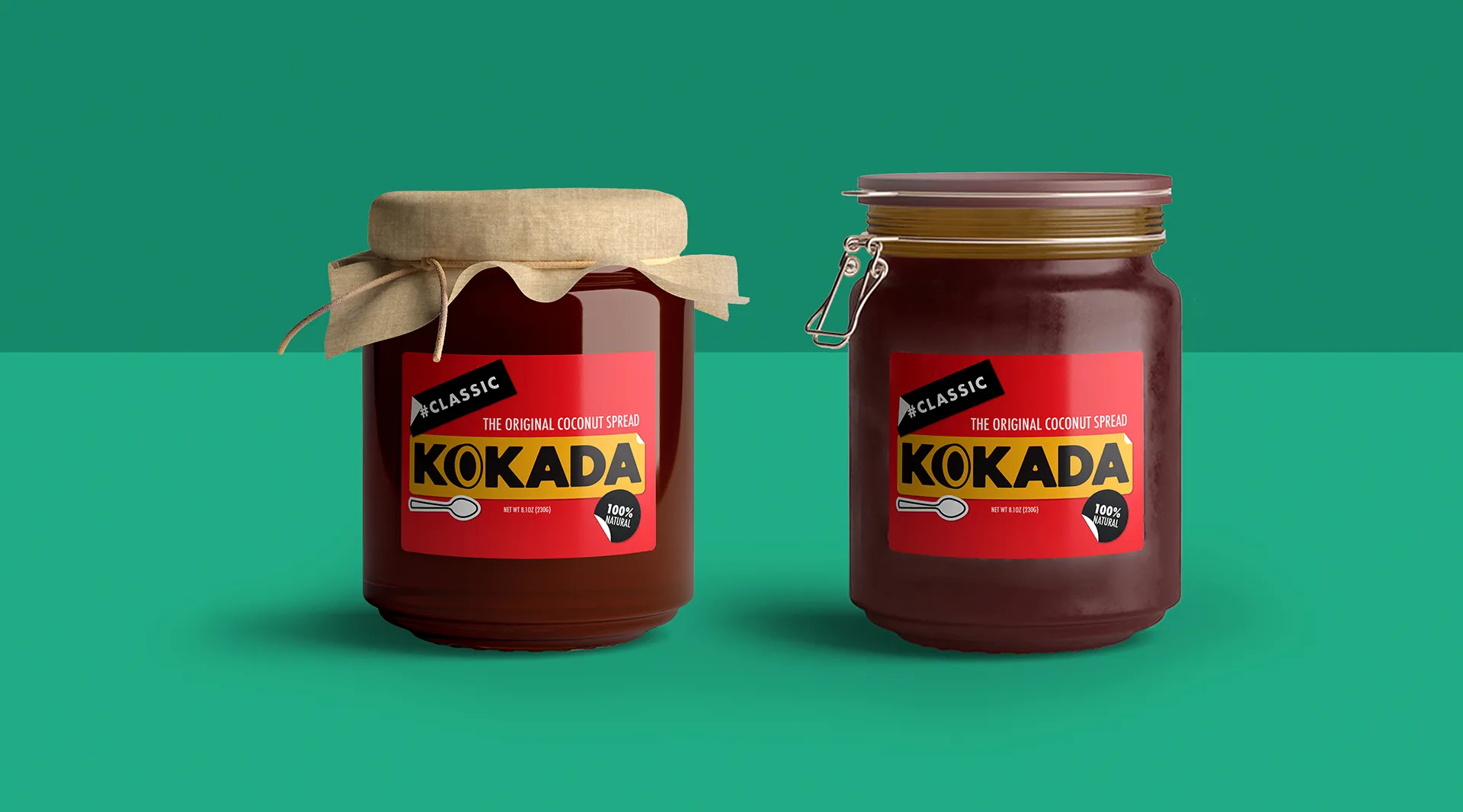
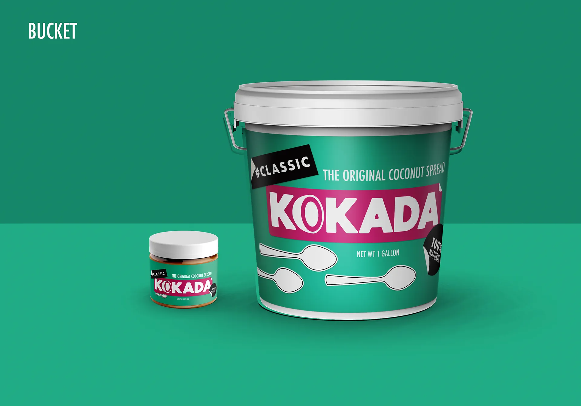
To bring the brand identity to life, I created mockups that showcased its application on various marketing materials – packaging, website design, social media graphics, and more. This step allowed the client to view the complete design in its full potential and showcased the cohesive brand experience across multiple platforms.